
Floral Design
9 Essential Principles of Floral Design, From Balance to Unity


Senior Contributing Editor
Credentials
- Features Editor and Designer , Lonehill Media Lonehill Media
- Formal training in nature photography
Writing for Petal Republic since 2023 · 17 articles
Expertise
Floral design, Gardening
Published In
The Gardener
The nine principles of floral design, defined plainly and compared across three design schools, with practical ways to apply each one to your own arrangements.
In Short
The principles of floral design that design schools agree on are balance, dominance, rhythm, proportion, contrast, harmony, and unity. Focal point and scale, which OASIS lists as secondary principles, make nine in this guide. Together they govern how the elements of a design are organized.
- Iowa State Extension, the AIFD course, and OASIS all list the same seven principles.
- Fragrance is an element of design, not a principle; unity takes its place here.
More Takeaways
- Proportion is the relationship of components to each other, while scale is size relative to surroundings.
- Iowa State's order for a vase arrangement: add greenery to establish the shape, then focal flowers, then filler and smaller accents.
How Three Design Schools List the Principles
Iowa State Extension, the AIFD course, and OASIS Floral Products were compared to see how each lists the principles of floral design. All three agree on the same seven principles, and OASIS adds secondary terms such as scale, focal area, and repetition.
| Principle | Iowa State Extension | AIFD | OASIS |
|---|---|---|---|
| Balance | Listed | Listed | Listed |
| Proportion | Listed | Listed | Listed |
| Dominance / emphasis | Listed | Listed | Listed |
| Principle | Iowa State Extension | AIFD | OASIS |
|---|---|---|---|
| Rhythm | Listed | Listed | Listed |
| Contrast | Listed | Listed | Listed |
| Harmony | Listed | Listed | Listed |
| Principle | Iowa State Extension | AIFD | OASIS |
|---|---|---|---|
| Unity | Listed | Listed | Listed |
| Scale | Within Proportion | Not listed | Secondary |
| Focal point | Part of dominance | Not listed | Secondary |
| Fragrance | Element | Element | Element |
1) Balance
Balance is the stability a design has when its parts are in equilibrium, and it can be either symmetrical or asymmetrical. In a bouquet it is actual, so it stands without tipping, and visual, so it feels steady to the eye.
This works the same way in floral design. A design that is top-heavy, bottom-heavy, or lopsided has a visual balance problem that will need adjustment for the design to be a success.
Some of the things to look at when contemplating balance are the following:
- Larger flowers and shapes attract the eye more than smaller ones.
- Warm colors and brighter colors attract more than cool and dull colors.
- Round shapes draw the eye more than lines or other shapes.
- Shinier leaves, flowers, and baubles are more apparent than muted elements.
- Denser arrangements will be more visual than airy ones.
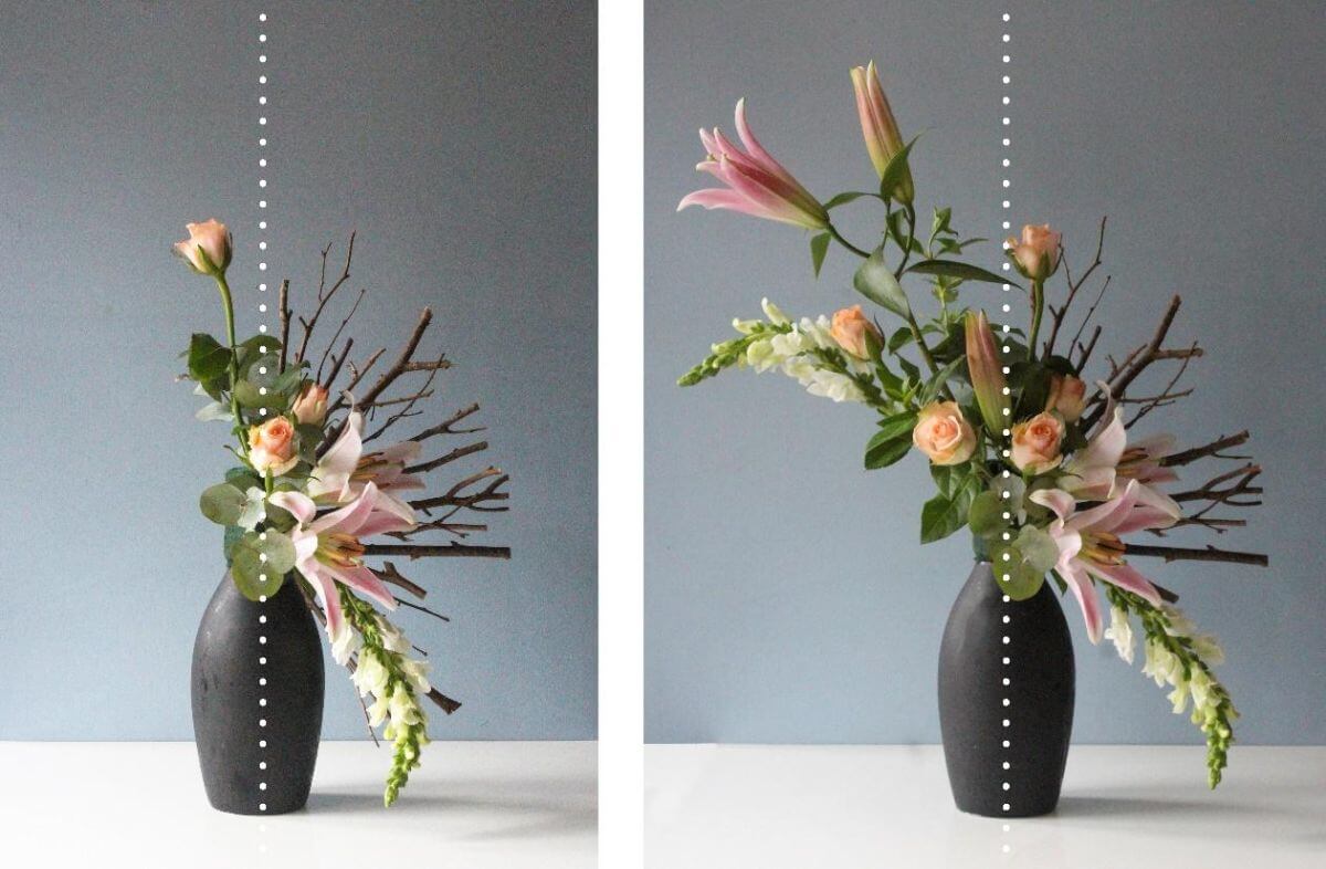
The trick to getting balance right is to use the horizontal and vertical lines as a guide. Suppose you take a pencil, for example, and hold it up in front of the arrangement in the center. Are both sides balanced? That is not to say the same elements because that would be boring, but does each side have equal weighting? In other words, does each size give a feeling of equal attention? A side that is perhaps too dominant may need adjusting or the other side adjusted to make it balanced.
It’s also important to note that containers are also considered as part of the arrangement and it can also be out of balance with the flowers in it.
Top-heavy
To balance a top-heavy arrangement, may need a change in container. The feeling is often – it’s going to fall over. Either reduce the number of materials in the vase, move to a bigger container, narrow the volume, or reduce the volume at the top of the flowers and increase the volume towards to container.
Bottom-heavy
This one is a bit more difficult to sense, but it invariably comes down to the container. In a low container, flowers may be placed too low and just need lifting to make them balanced. Often, it’s the scale that’s important – a container that is too big, too shiny, or too bold may cause a visual weight towards to base. Choose to change the container or make the plant material bolder to match.
Symmetry and Asymmetry
It stands to reason that symmetrical designs are easier to balance – just work with a shape and make sure the visual lines are equal. It is trickier with asymmetry. You will be using different plant materials for the left and the right of the central vertical line, but to make it balanced each side must have some sort of visual weight that is equal. A large flower on one side can easily be balanced by a striking branch on the other. Not often the case but an asymmetrical arrangement can sometimes become balanced by placing it in the proper setting or offsetting on a surface.
2) Creating a Focal Point
A focal point, or focal area, is the area of greatest visual impact in a design, the center of interest to which the eye is naturally drawn and the part that anchors the design. Often the focal point sits just above the edge of the container and is usually made of dominant material such as a large flower. A focal point can be achieved with material that has color, shape, texture, and size and is well placed towards the center of an arrangement. Large items are not placed on the outside as they unbalance the design. The outside is for more delicate, longer wispy materials. However, placement near the center is not always the case, as long as the design has balance.
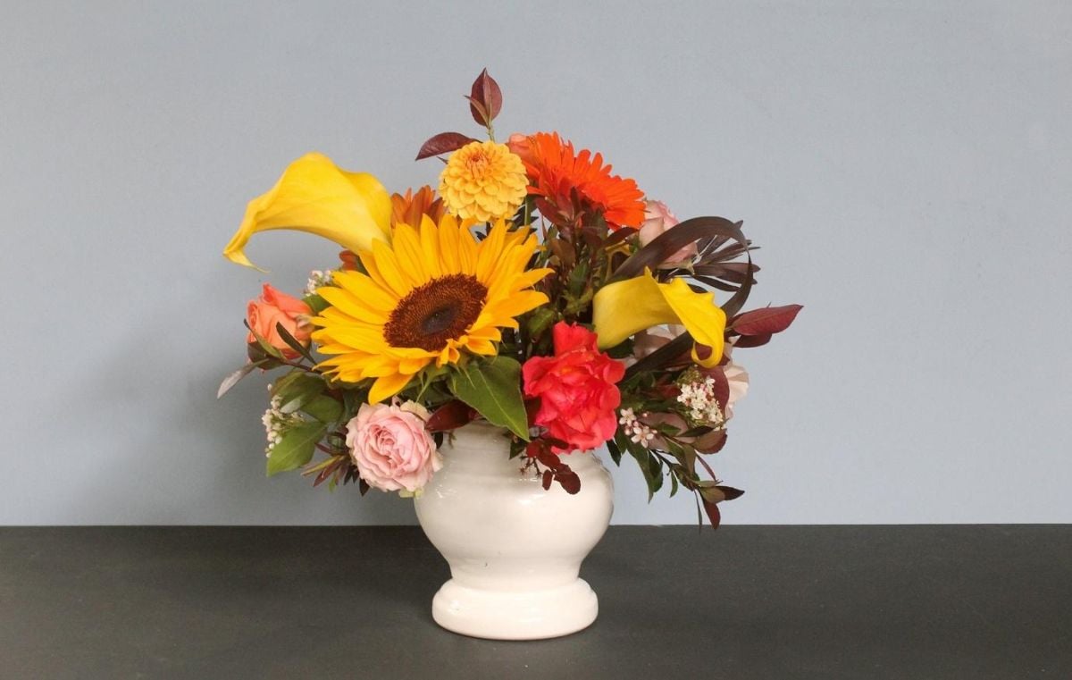
A large flower or group of flowers to create a focal point placed slightly off-center in a design will have movement and will make it more pleasing to the eye. Florist Adena Einfrank told Livingetc that odd numbers look more dynamic to the eye.
Whether placing a large flower like a sunflower vertically or coming forward in the arrangement is of no matter as long as it’s placed in the area of dominance. Different effects are achieved using both.
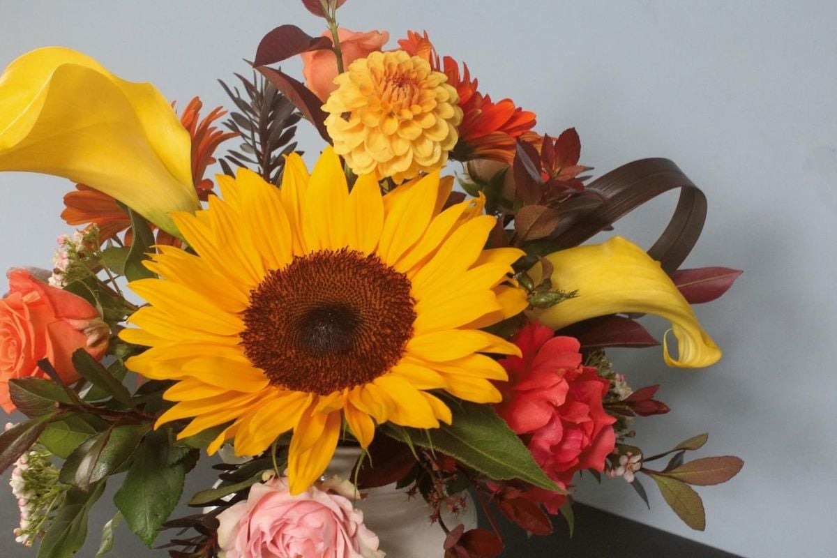
Further, accentuate a focal flower by guiding the eye towards it using greenery as a neutral base around it.
3) Dominance, Accent, or Emphasis
Dominance, also called emphasis, is giving one or more parts of the design more weight than the rest, using a focal point or accent to draw attention. Just like a movie production will have leading cast members and supporting roles, so does a flower arrangement if it is to be harmonious and balanced. A design where every part carries equal weight has no dominant part, so nothing leads the eye.
Iowa State Extension says the container should complement the design rather than distract from it, with the flowers remaining the main focus. The background, the surface the arrangement sits on, and any accessories in a supporting role are the supporting players to those floral stars. Most designers will agree that the flowers, leaves, and other plant materials are where the emphasis should be – the arrangement becoming the focus in the setting and further that there should also be the stars and the supporters within the arrangement itself.
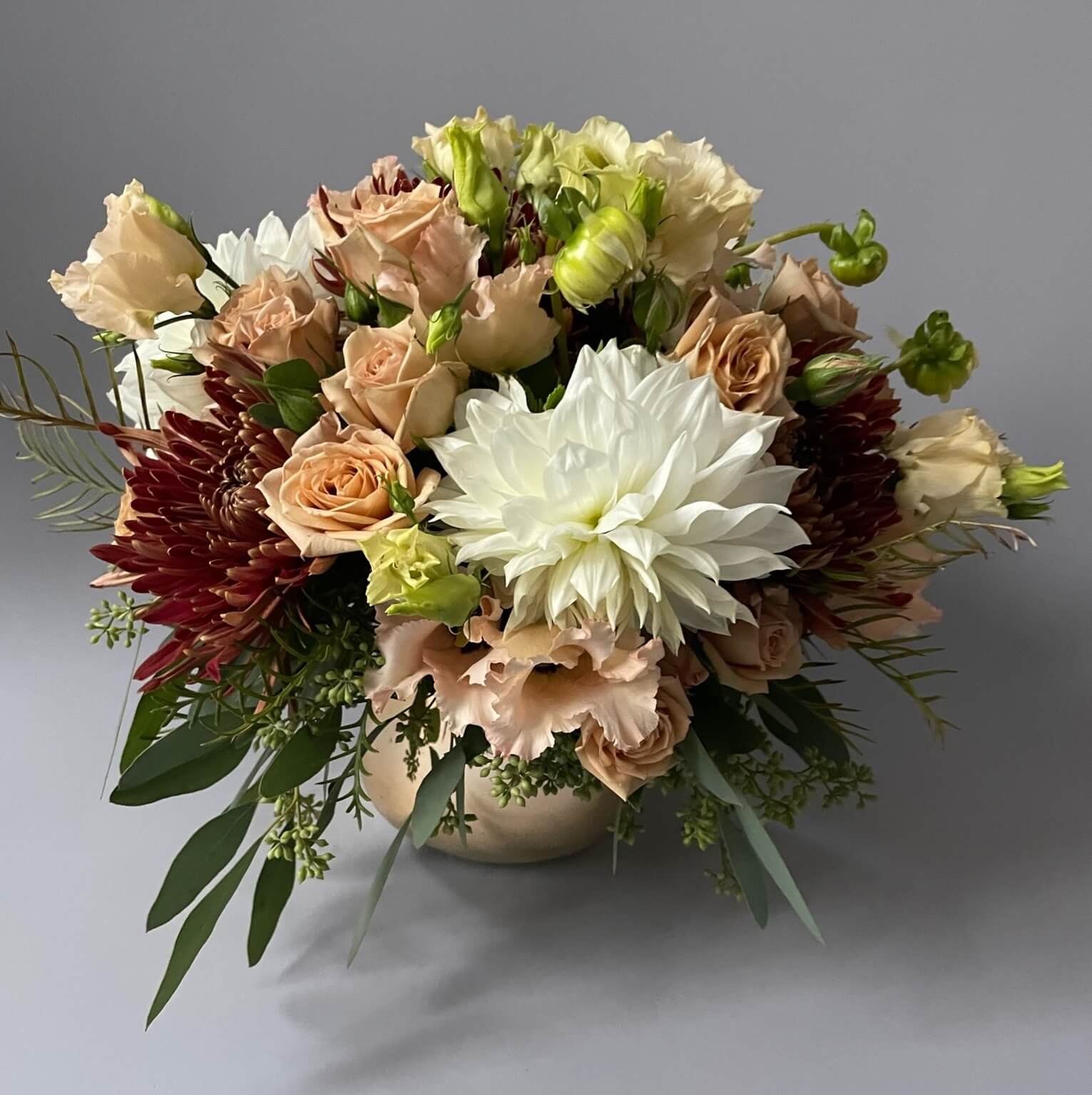
The stars of the show can be any of the following:
Large Flowers
The easiest way to create a focal point or accent is with large flowers and not too many, or a grouping of smaller flowers that form a large mass.
Shapes
Some shapes draw the eye more than others. Shapes create points that are then interesting to the eye. Round shapes have more impact than others.
Bright Colors
Brighter colors attract the eye more quickly than muted tones. For impact, a dominant color is a great way to create emphasis quickly and easily.
Shiny Textures
Out of all the textures, shiny will have more of an impact than rough, sandpaper textures.
If you really want to make an impact, the star can also be large, rounded, in a bright color, and shiny. But you cannot then forget the supporting roles that need to be included to keep the balance perfect.
Troubleshooting
Dominance in a design must be added with care and thought. If for example, you have two bright large dahlia flowers as the stars, they may compete with each other and become uncomfortable in the design. It would be better to just have one large colorful dahlia and fill in with a supporting cast of more muted tones.
Consider that there could also be competing items like a large shiny vase that takes the focus away from the flowers. In the case of this type of vase, it would be best to include big bold shiny flowers to balance the design. In most circumstances, it would be better to let the flowers stand as the striking bits and use more downplayable mechanics.
Sometimes a beautiful piece of wood or a rock can be the dominant part of a design with few artfully placed flowers or foliage acting as the supporting cast.
4) Rhythm
Rhythm is the visual movement through a design, the way the eye is led from one part to the next, usually through repetition, gradation, or pattern.
For a flower arrangement to have rhythm, it needs to be built up and evolve as you develop the look. Iowa State Extension names three ways to show rhythm: repetition of design elements, placing components at different levels for depth, and gradual change or transition. The sections below cover repetition and transition, then add simplicity, which OASIS lists as a secondary principle, along with line, radiation, and curves.
Line
Good framework lines create a way for the eye to move around the design creating the rhythm and the points at the ends of the lines are the periods of rest needed for the design to fully embrace the flow. Large dominating items like a large flower can sometimes drag your eye to it and ignore everything else in a design, thereby stopping the rhythm. Not enough lines will do the same as well as too many lines.
In a line design, two of the same flowers will provide more rhythm than one, but two flowers of different sizes, or one more open than the other, create balance.
Repetition
Repetition is a great way to get the basics right. Repeating shapes in the design and the mechanics can create rhythm. For example, long tall plant materials in a long tall vase have rhythm, and also a curved vase with curved lines and shapes has rhythm.
Repetition in color is also important. One stark color will stop the eye and keep coming back to it, voiding rhythm whereas a few of the same color throughout the design can create more rhythm and harmony. Just as in dominance, the supporting actors play a vital role in contributing to the whole.
Always use more than one of any type of plant material. You can imagine one piece of ruscus looking very out of place without a second or a third in a different position to create balance and rhythm.
Transition
An example of transition can be seen in a tree. The trunk is broad with the ends of the branches getting smaller as you move up the tree. There are no stark changes in the line of a tree that would cause the eye to stop and lose rhythm.
Transition helps in a flower arrangement as well. We start with the bigger more compact middle and move outwards to the lighter and smaller blooms and twigs and leaves that flow in its transition.
Color transition is often used to create rhythm by using a bridging color between two colors. For example, using an orange flower between a yellow and a red flower, tones the two down and links them.
In some cases, the opposite of a calming transition will create an arrangement that is bolder and sharper with a more exciting rhythm, so it’s good to remember that a soft, easy transition is not always the answer to good design.
Simplicity
There is such a thing as too much stuff in an arrangement and it’s often the time you can say, that’s enough, that makes a good designer. Too many overlapping leaves, too many overlapping flowers, buds, and branches can muddy the rhythm of a piece and have no way for the eye to move through a design with ease. Some arrangements with very little plant material, often have a stronger rhythm than those packed with plant material.
Radiation
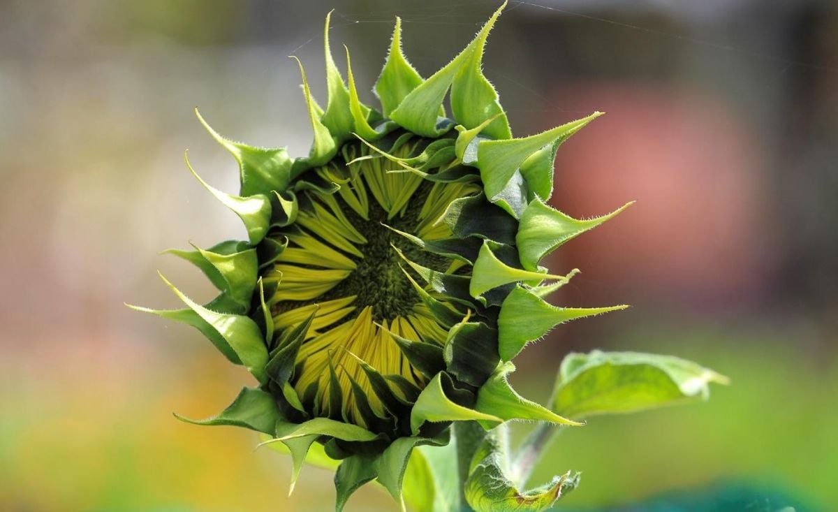
Not always necessary in contemporary design, but very useful in more traditional arrangements, plant material that radiates outwards from the center to points has a rhythm that is pleasing to the eye. A lot of plants in nature follow this rhythm – palm leaves that radiate from the center to points, rosettes of petals radiate from a central point, and tree branches radiate haphazardly outwards to points, as examples.
Curves
More than any other shape, curves will automatically create more rhythm in being curved. Curved plant material is more playful and evokes a rhythmic dance structure.
5) Contrast
Contrast is the difference between the parts of a design, and used well it adds interest. Too many things of equal interest lack that excitement.
Using contrast in a flower arrangement can make the monotonous and dull, bright and exciting. One of the easiest ways to add contrast is with color as can be seen by making use of The Color Wheel. Colors across the color wheel add instant contrast.
Another way to add contrast is with shape and texture. Iowa State Extension splits contrast into variation (similar elements with minor differences) and opposition (elements in complete contradiction with each other). The same shape through the design can be a bit boring, but add another shape, and it becomes more interesting. The same can be said for varying textures in an arrangement.
There is a word of caution, though, when too much contrast will become jarring and not be pleasing to the eye. Link areas of contrast with bridging plant materials or colors, and make sure the areas of contrast relate to each other in some way to smooth out the transitions and make the arrangement more pleasing.
6) Scale
Scale is the size of the whole design relative to its surroundings, such as the room, table, or building; flowers that are too big for a small container are an example of scale that feels off. In nature, we can see this out of scale if you find a large tree in a small garden. Scale, however, is all relative and will only become apparent as being out of scale when seen in comparison to other objects in the room or area where the flowers are displayed. Also, the separate objects used to make up a flower arrangement – flowers, foliage, other plant material, accessories, containers, and the base – need to be in scale with each other.
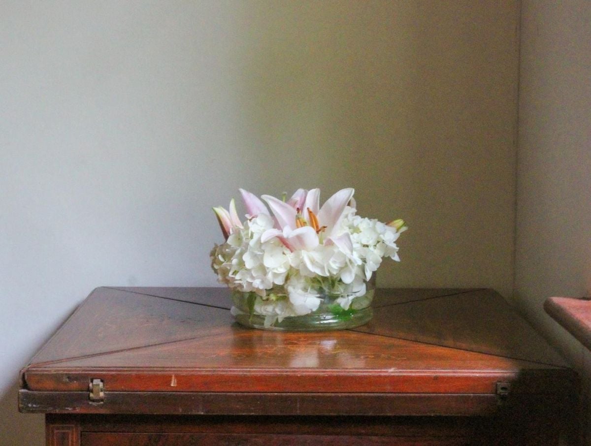
An example of an arrangement out of scale with its surroundings.
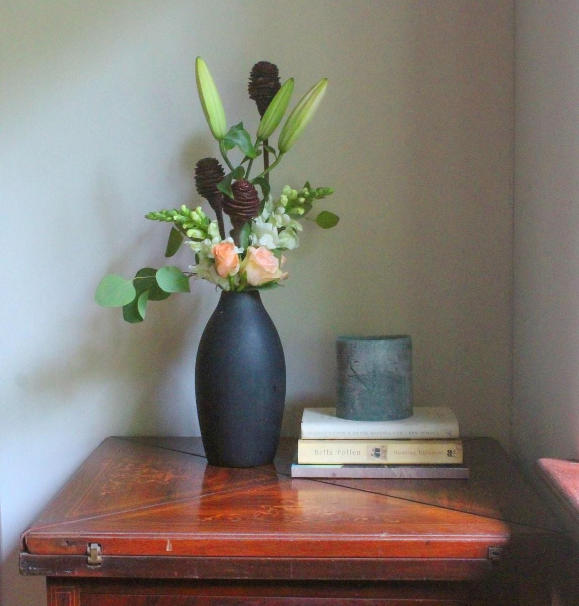
A more balanced scale.
Here are some points to look out for:
- Each piece of plant material should be in size related to each other or have enough transitional elements to make the journey flow from large to small sizes.
- The plant material or accessories should be related in size to the container it is in. A large dahlia bloom would look out of place in a small glass.
- Often a large container does not have enough plant material or height to make it in scale. The same goes for small containers and too big or too many flowers.
- The position on a base or table should also be in scale. It is often the case that a base like a mirror for instance is too big for the container and the flowers.
- The whole arrangement should be in scale with its surroundings. A table arrangement needs to fit within the table settings of crockery, cutlery, glassware, and food, while a church may need a big extravagant arrangement to be in scale with its surroundings.
Whether you are designing miniatures, cascading displays on pedestals, or mimicking nature, the scale should always be top of mind with all the elements placed in relation to each other, as one would find in nature.
7) Proportion
Proportion goes together with scale in a lot of ways. Proportion is the size relationship of one part of the design to another or of a part to the whole, such as flowers to their container.
At the end of the day your eye will be the best judge of good proportion.
OASIS describes a traditional tall arrangement as having flowers one and a half times the height of the container. For a low arrangement such as a mound or cube the ratio is 1.5 to 1, and for a vase arrangement the vase is one third to one half the height of the design. This is not set in stone however as some containers ‘look’ heavier or lighter just by the different materials used – think glass compared to bronze – which may have the same proportions and the same weight but will appear different.
Rely on your eye and you should be able to tell easily enough if the proportion is good or not so good.
8) Harmony
Harmony is the quality a design has when all its parts interact, with materials chosen so they form one composition and are consistently related. The relationship when things (plant material, objects, and accessories) are brought together can create harmony. Often harmony can be seen in the relationship of objects with each other and there is usually some link that can be found that makes it so.
Some principles that create harmony include things like repetition, texture or using a shape to form a relationship. Take a vase in one color and bring in tones of that same color in the flowers and foliage. Add to the curve of a piece of driftwood with the curve of a branch of willow. A velvet base could be mimicked in a velvety petalled flower. In basic terms, add an echo of any sort that links spaces and you have harmony.
9) Unity
Unity is the oneness created when all the components of a design share the same thought, purpose, style, and feeling, as Iowa State Extension puts it. OASIS describes it as a cohesive relationship of all parts. It is the last of the seven principles the three design schools share, and it is what makes an arrangement read as one piece rather than a collection of separate flowers.
Repeating color, texture, form, or pattern builds that sense of unity, organization, and cohesiveness. Pick one of those elements to repeat throughout the arrangement and let the rest of the design support it. That single thread is what ties the whole piece together.
Further reading: Essential Floral Design Tools, and Types of Vases, Vessels, and Container Used in Floral Design
To go further, see floral design classes in NYC, ikebana flower arranging and what posies mean.
Questions and Answers
What is the 3-5-8 rule in flower arranging?
The 3-5-8 rule is a florist guideline for grouping flowers in odd numbers, usually in bunches of 3, 5, or 8. It is a working florist convention rather than a rule from design-education bodies.
Is fragrance an element or a principle of floral design?
Fragrance is an element of floral design, not a principle. AIFD lists fragrance among the elements alongside line, color, form, space, pattern, size, and texture, and OASIS also names it as an element, defining it as a sweet or pleasing odor perceived by smell. Iowa State's element list leaves fragrance out, so the split among sources is between listing it as an element and omitting it, not calling it a principle.
In what order do you build a flower arrangement?
Build a flower arrangement from greenery to focal flowers to filler, after the container and mechanics are set. For a vase arrangement, Iowa State Extension says to fill a clean container with fresh water and floral preservative, set the mechanics, add greenery to establish the shape and form a supportive base, place the focal flowers next while watching proportion and balance, then finish with filler flowers and smaller accents to fill gaps.
Sources4 sources, linked in the text
Updates and CorrectionsOct 18, 2026 · 3 corrected
- Added: A comparison of how Iowa State Extension, the AIFD course and OASIS list the principles of design.
- Corrected: 2 unsourced figures (zones, counts, sizes or dates) were corrected to a source or removed.
- Corrected: Fragrance was listed as a principle of design. AIFD and OASIS list it as an element; the ninth principle is now Unity, which all three sources list.
- Corrected: One photo that showed a different plant was replaced.
Save and Share
Reader Comments
Have a question? Ask it here.